Tutorial
Creating maps with multiple layers in Tableau / 2
Creating maps with multiple layers in Tableau / 2

This is the second part of our tutorial about multi-level GeoViz. That's why we continue right where the first tutorial left off. This can be found here: Creating maps with multiple layers in Tableau . In this article, we would like to expand our multi-level geographic visualization. We're particularly interested in adding details to the superstore's sales data, which we've already used as a data source in the first tutorial.
Creating multi-level geographic visualizations / 2
To add details about categories to our visualization we remove the sales data from our second map, which we have earlier added to the first map with the Dual Axis option in Tableau.

In order to get accurate details about the respective product segments of the superstore, we take the Category dimension and drag it to the Color button..

It becomes clear that the desired visualization can not be displayed in this way. Therefore, we select our categories and display them as a pie chart. Now the three product segments should each occupy one-third of each pie chart. Excluded are the states in which only one or two of the product segments are offered. These are filled with one or two colors.

To sort the individual categories by sales, we need to drag the corresponding value to the Details button. Now Tableau should calculate the individual pie charts according to the sales and visualize them.

We now get a visualization, which is rather poor, especially in the Northeastern United States. To fix the problems, you can set the size of each pie chart according to your preferences. We can now see which states receive how much of their turnover from which category.
This makes it clear which category is most often sold in the respective states. The state of Kansas, for example, obtains only a small part of its sales from the furniture business. It also shows that a clear diversification of revenue sources does not necessarily correlate with high profitability, as one might expect at first glance. Worse-cutting states such as Texas, Pennsylvania and Illinois all have relatively evenly distributed sources of revenue.

Nevertheless, we can not see exactly how many percent of sales belongs to which product category . To make this happen we need to add a calculated field to our dashboard.
We name this according our preference and insert the following calculation:
{ FIXED [State], [Category] : SUM([Sales]) } / { FIXED [State] : SUM([Sales]) }This calculation explains to Tableau that we want to rank the share of sales by category and state. Here it is particularly important to pay attention to the parentheses, so that the calculation is valid and can be performed.

To display what we just did we drag the field with the calculation to the Details button.

To see our percentage we need to add it to the tooltip displayed while clicking on a pie chart. For this we select Tooltip and add our calculation with the Insert button. Here we can basically change the color and the font according to your own wishes. I like to see the relevant values in bold and a bit bigger than usual..

Now, all we have to do is determine the format of our calculation so Tableau knows it's a percentage that comes out as the result.

Now we can see what proportion each category has in terms of superstore sales in a state. The same method can be used to determine the profitability of a state. Incidentally, other values just need to be dragged onto the Tooltip button to add as text to our visualization.


These steps can be used to visualize other data sources, which only need to contain location data, whereby coordinates are less suitable. The easiest way is to visualize well cleaned data sources that contain location information known to Tableau.
Build the same visualization with Ponychart
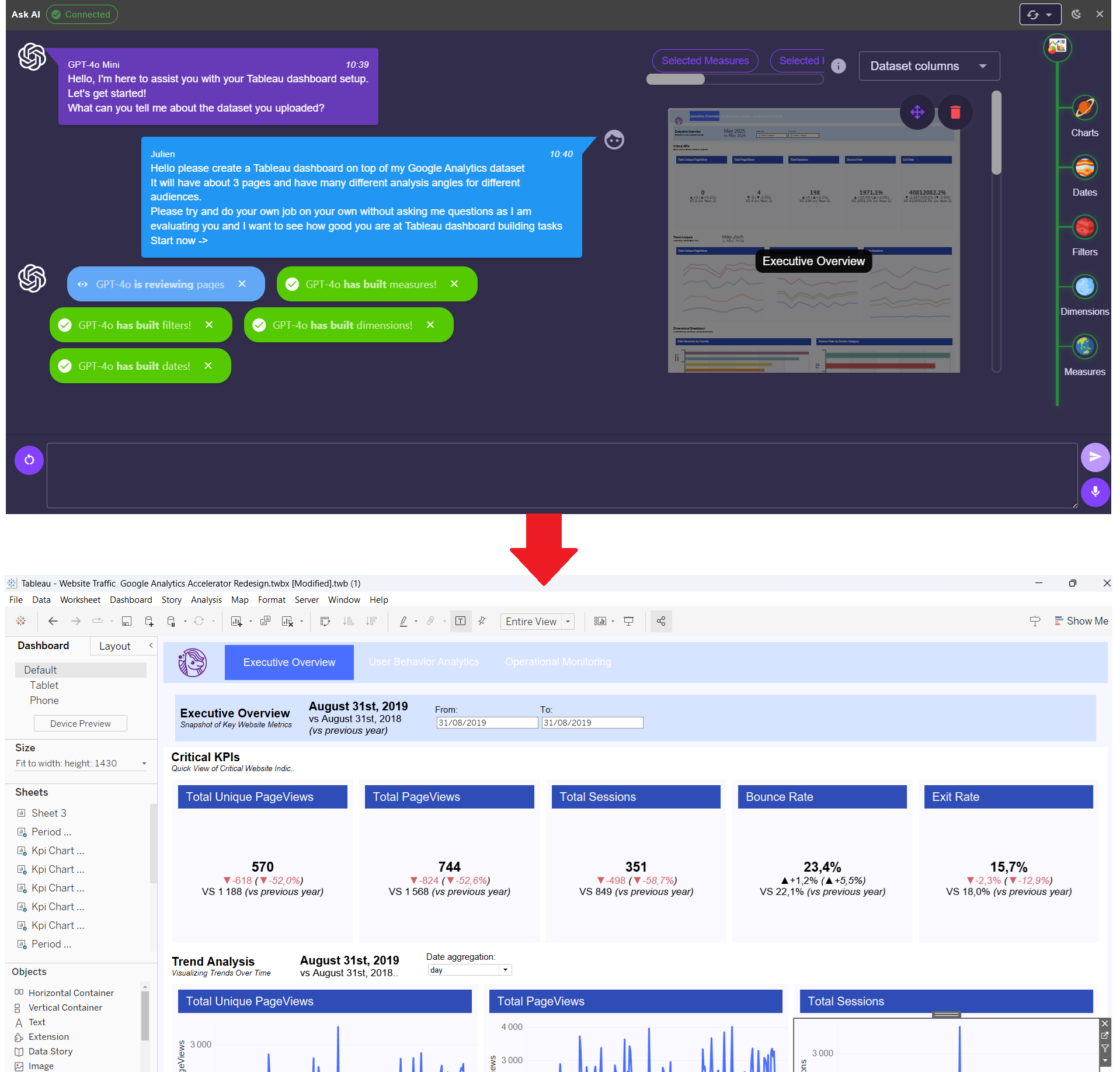
Tableau is complex and has a steep learning curve that makes getting into the program very hard. Ponychart enables you to leverage Generative AI coupled with an online wizard to create advanced dashboards in minutes.


