Tutorial
Creating maps with multiple layers in Tableau
Creating maps with multiple layers in Tableau

This tutorial is about creating geographic visualizations in Tableau with multiple layers. To keep it simple we used the sample data, which is available here .
How to create maps with multiple layers in Tableau
Geographic visualizations have the disadvantage that they often don't provide enough information to the viewer. Advantages are that they are easy to read and fun to look at. To integrate more information into geovisualizations we use the dual axis feature in Tableau.
Before we start we need to import our data source into Tableau. Then we drag the dimensions State and Country into Rows. Now Tableau offers you to create a map with its Show Me function. Since our data source deals with the USA, we go for a slightly simplified map of the US mainland.

The information density of the map can be adjusted under map layers. We like to use a relatively basic map that only includes the outlines of the individual US states.

To add values to the map we have to drag a field from the Measures area onto the Color button associated with our visualization. We would like to visualize the states according to profit, and therefore use the corresponding value.

Now we get a visualization, which represents the differences in the profitability between the individual states on the basis of color distinctions. It becomes clear that the state of Texas is the least profitable one. If we look at the legend, we even recognize that the state of Texas generates losses for the Superstore.

However, the colors used for display can be changed as desired. In order to facilitate the evaluation of the visualization, we choose a red-green color scheme. To change the color of our visualization, we click on the color button and choose our preferred colors. I recommend to choose the full color range as well.

Then we use the dual axis function. To prepare for that, we duplicate our above location data. This can be done with clicking on our value with a pressed ctrl key (cmd for Mac OS users) and then dragging it next to the existing value. Now we should be able to recognize two fields, which later merge into a map with multiple layers.

After that, two maps are displayed. The second visualization is now suitable for integrating a second value into the first map.

Now we can improve the second map with a new value from our Measure area. We choose to compare sales and profit, and therefore replace the sales value with the profit value in our second map. (If you drag the value Sales directly to the Size button you will get an interesting visualization.)

Now we adjust our second map with a right click and select the Dual Axis function. I choosed to use white as the second visualizations color to get a better overall result when merging the maps.

This is our final result. With this visualization it becomes clear that sales are relatively high in Texas. The reason for the lack of profitability lies therefore probably in fixed costs or other issues reducing the free cashflow of the Superstore.
Thank you for reading, we will use this visualization to create something more advanced in one of the next tutorials..

Creating maps with multiple layers for your own business
Reviewing this tutorial, it becomes clear that profound Data Analytics can lead to powerful results. Various aspects that we have taken up in this visualization and learned about the fictitious company can significantly increase the profitability of a startup. However, mastering Tableau requires a lot of effort.
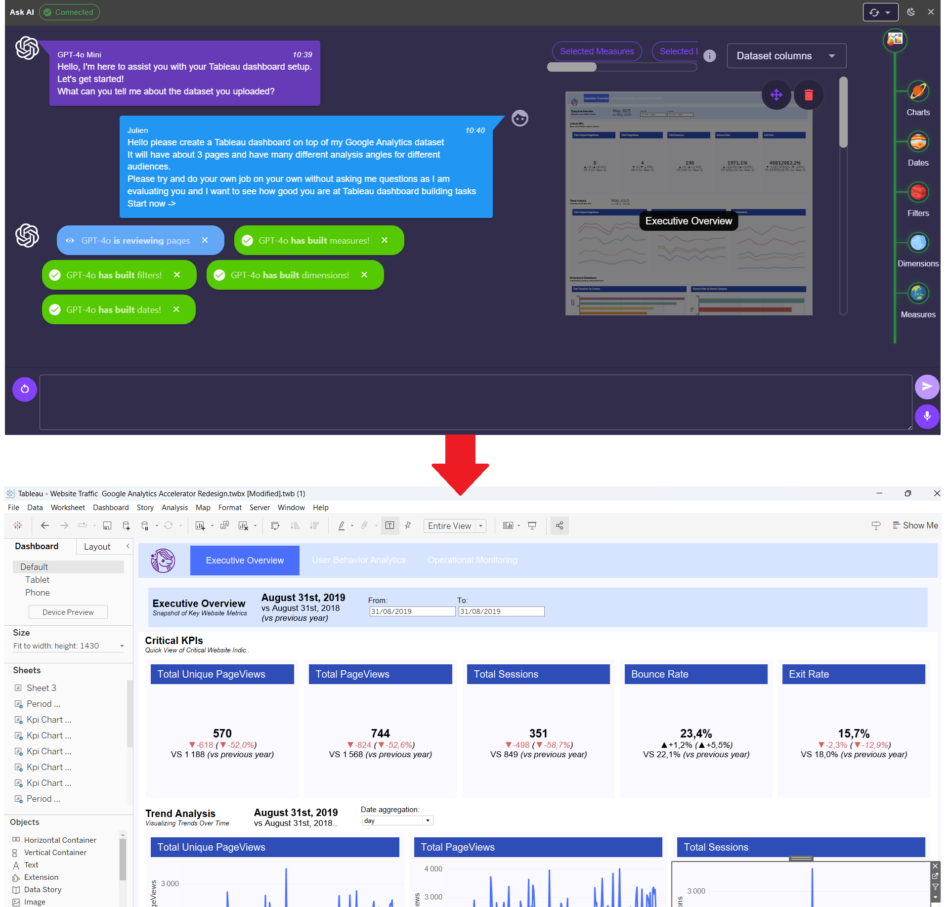
Ponychart is an easy-to-use application that enables analysts to build advanced dashboards in a few clicks with the help of Generative AI.
Ready to have a look at Ponychart?