Tutorial
Tutorial C : Period comparison in the case of a bubble chart in Tableau
Tutorial C : Period comparison in the case of a bubble chart in Tableau

This tutorial is part of a series of tutorials on period over period analysis in Tableau. You can find the previous tutorial here:
An interesting way to display period over period comparisons is when involving the bubble chart because it involves some deep understanding of how Tableau works. In this tutorial, we will see how to build such a chart (part C of the tutorial series).
1 - Create a simple bubble chart
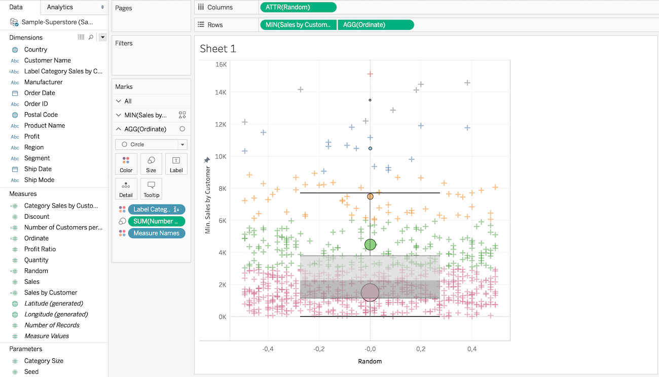
Let's assume you have to compare 2 metrics and their respective evolution against a given dimension. The bubble chart with one metric on the X axis, the other on the Y axis and the dimension on the detail shelf is a good way to do this.
To do so, simply follow the steps below :
- Drag your dimension to the detail shelf on colors
- Drag the [f. Is In Period] calculation we made previously to the filters where you'll only select "true" as valid values (this will only keep values that are in the reference period or the comparison period).
- Drag your first metric to the columns shelf and your second metric to the rows shelf.
- Finally, drag the [f. Is This Period] calculation to the details shelf as a shape. That way, if we are in the reference period, we will have a circle and if we are in the comparison period, we will have a dotted circle for instance. Optional: you can edit the aliases for the true and false values to make it more explicit that true means "selected period" and false means "comparison period".
Here's how it should look like :
If you need them, here are some images you may use for the shapes :


That is all well and good and works well for simple cases such as month vs month-1. Basically you can stop the tutorial now if the comparison period never overlaps with the selected period (which should be enough for most usecases). However, if the comparison period overlaps with the selected period, some data will be missing for the comparison period since it'll already be shown in the selected period "bubble". Let's see how to fix this in part two of this tutorial
2 - Fix the overlapping issue with Level-Of-Detail Expressions
Again, let's remind you that if your comparison period do not overlap with the selected period, you can stop the tutorial now. However, if you need to display overlapping periods, you will need to use Level-Of-Detail Expressions and adapt slightly the previous steps.
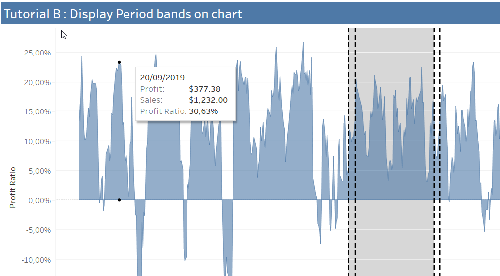
Let's try to vizualise the issue first. Let's say we want to compare the sales of the last 3 months with the sales 2 months before. We should have an overlap of 1 month which should look like this :
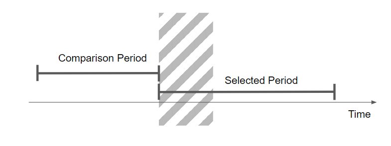
Basically if we do nothing to our viz, the metrics for the comparison periods in the last month will be missing since they are already displayed in the selected period. The comparison period is simply computed over 2 months while the selected period is computed over 3 months.
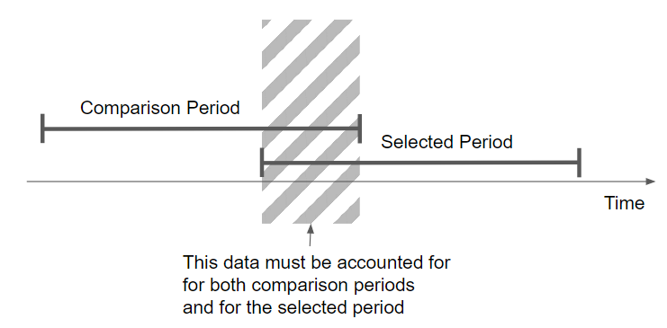
Here is how we may formulate the issue:
- We need to compute the values for the comparison period while "ignoring" the impact the selected period has.
Said differently:
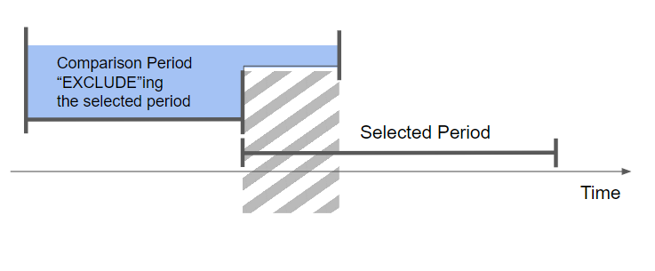
- We need to compute the values for the comparison period EXCLUDEing the selected period. You should now see where I'm going and why LOD expressions come in handy.
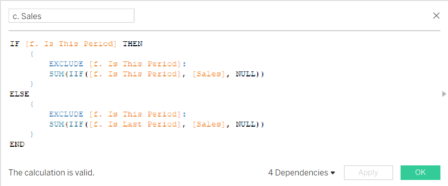
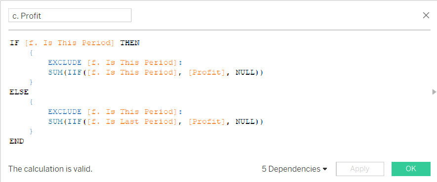
Now, we will take [Sales] and [Profit] as examples for our bubble chart.
When can decompose our new calculation into 2 sub-cases:
- When we are in the selected period, then we basically need to compute the SUM for [f. Is This Period] while ignoring (EXCLUDE) [f. Is This Period] since it is on the details (Marks) shelf.
- However when we are in the comparison period, then we basically need to compute the SUM for [f. Is Last Period] while ignoring (EXCLUDE) [f. Is This Period] since it is on the details (Marks) shelf.
Basically, the formula becomes :
IF [f. Is In Period] THEN
  { EXCLUDE [f. Is This Period]: SUM(IIF([f. Is This Period], [Sales], NULL))}
ELSE
  { EXCLUDE [f. Is This Period]: SUM(IIF([f. Is Last Period], [Sales], NULL))}
END
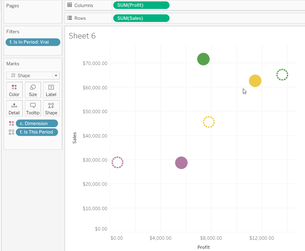
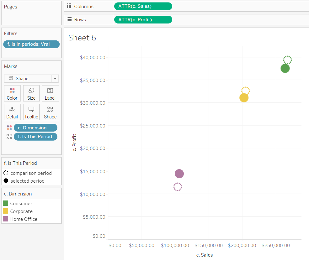
Simply repeat the operation for the [Profit] metric and you should get the following result :
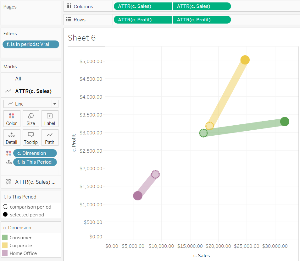
And that's all there is to it ! You can simply replace the Row and Column pills with your own metrics and you should get the following result (here I went further and added trails between periods by using dual-axis for both rows and columns) :
Additionally, you can use Tableau double-axis feature to draw lines between each period to further give your users the feeling of evolution from one period to the next.
- Drag the newly created [c. Profit] and [c. Sales] metric again on rows and columns.
- Right click on each of the newly dragged pills and tick "Dual Axis"
- Now right click on each newly created axis and select "Synchronize Axis"
- You should hide the headers of the right axis by right clicking on the axis and unticking "Show Header"
- On the Marks shelf, select the Line mark type for the first Mark
- Adjust the transparency of the color to around 20% for the first Mark (you can do this by right clicking on the color Icon)
Here is how it looks now:
Final disclaimer: It is important to understand that this chart still is not perfect. In the case of a very "sparse" dataset where data is not continuous, it may happen that some "dotted" circles will not appear when there is no data in the "left" part of the comparison period. There is basically no way around it so you should only use this chart when your dataset is "continuous" and does not present gaps.
Happy Tableauing!