Tutorial
How to use box plots and point clouds in Tableau
How to use box plots and point clouds in Tableau

This post is all about box plots and point clouds in Tableau. The idea is to create a visualization with information about the statistical distribution of your data. In this example I'll be using the Superstore dataset (included with Tableau Desktop). If you use Tableau Public, you will find the data here.
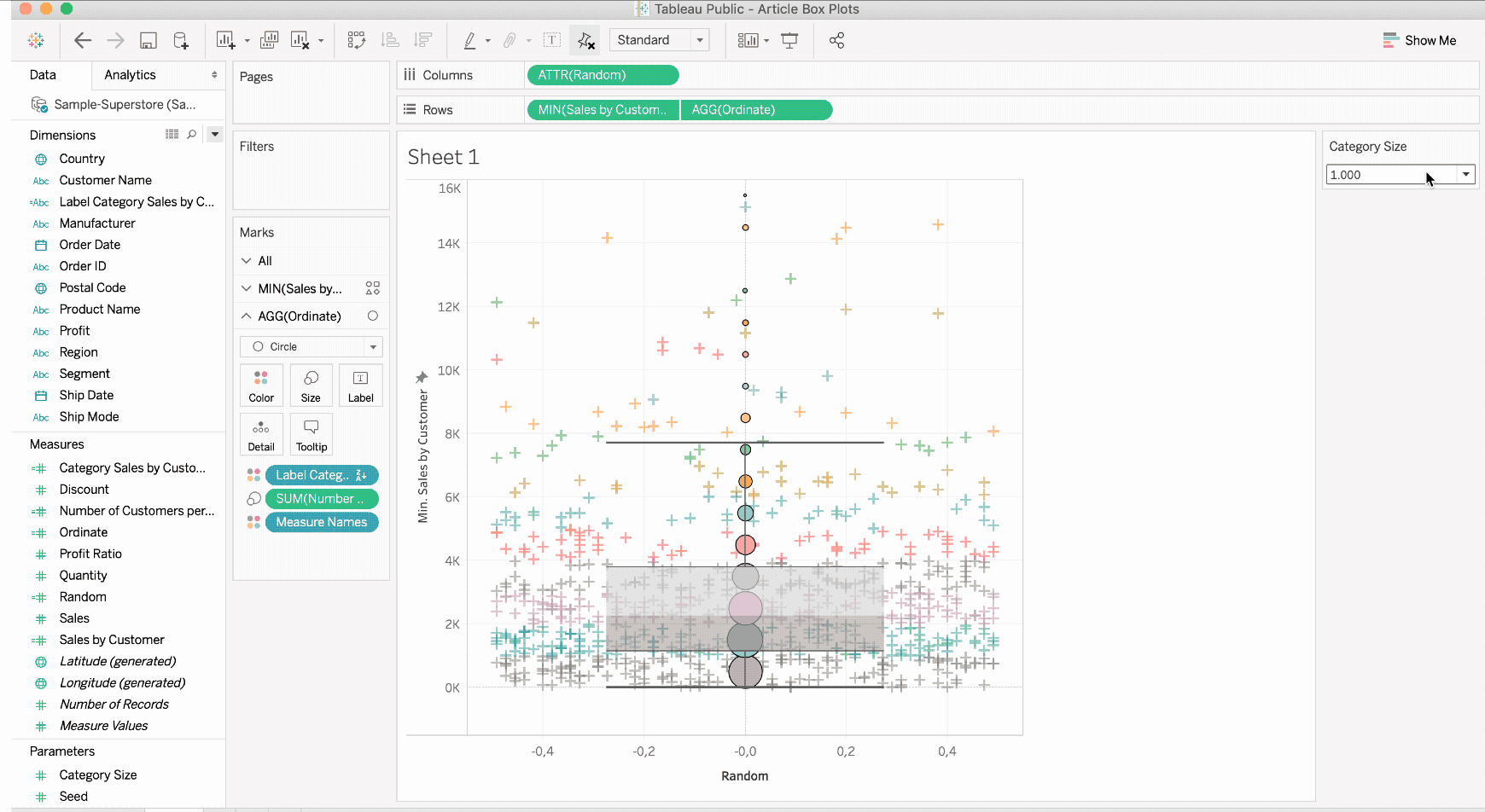
As you can see in the visualization above, there is a sales view for each customer within a point cloud. I used a box plot to get the medians, quartiles, and deciles of our dataset. It is also possible to group customers by sales, for example, to obtain an aggregation of thousands.
In the following tutorial, you will learn how I came to the result. If you have questions or encounter problems, you can contact us at any time. Enjoy!
1. The foundation of box whisker plots and point clouds in Tableau: LOD expressions
To make my data easier to work with, I use level of detail expressions to calculate sales by customer, sales category, and number of customers by category.
Since I want to give the user the ability to resize sales categories, I'll create an Integer parameter [Category Size]. Personally, I will use the values 1000, 2000, 3000, 5000, and 10000 but it'll work with any values you'll choose.
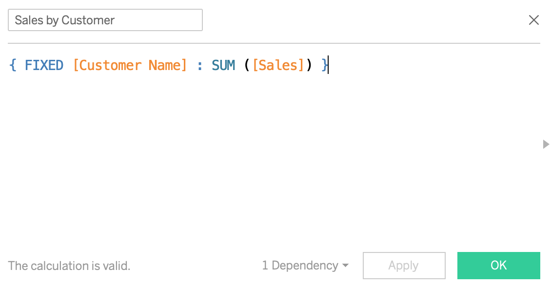
To determine the number of sales for a customer, I use the FIXED calculation on [Customer Name] and calculate the sum of [Sales]. You can also use INCLUDE or EXCLUDE as LOD calculations if you want.
{ FIXED [Customer Name] : SUM([Sales])}
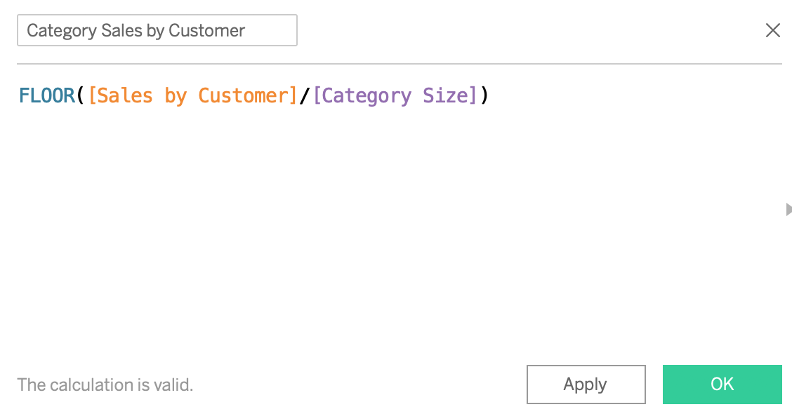
Next, I calculate in which class a customer is by dividing sales per customer by [Category Size] and then approximating the smallest integer.
FLOOR([Sales by Customer] / [Category Size])
To clarify the calculation, I add a calculated field, which I call [Label Category Sales by customer] and which indicates between which values the record lies.
STR([Category Sales by Customer] * [Category Size])
+ "<" +
STR(([Category Sales by Customer] + 1) * [Category Size] - 1)
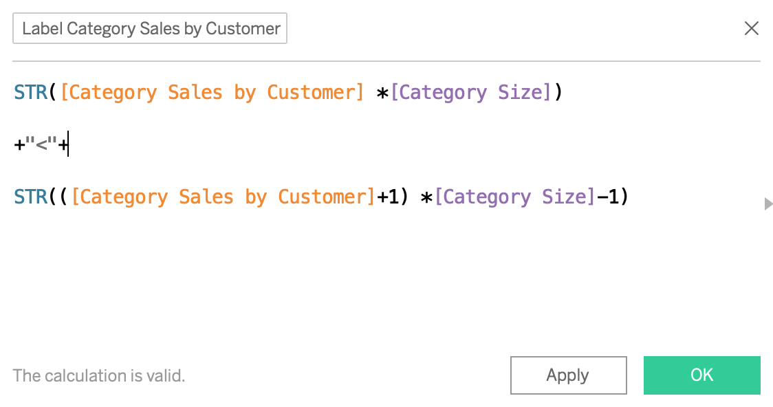
This field will provide me with uncomplicated legends of the style 1000 x 1999. Finally, I calculate the number of customers in a given category [Number of Clients per Category] with a second calculation by level of detail.
{ FIXED [Category Sales by Customer] : COUNTD([Customer Name])}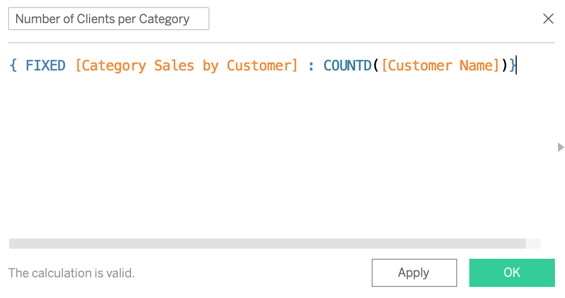
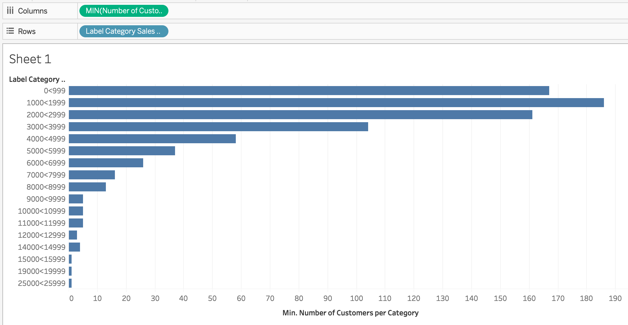
Here's the result we'll get afterwards:
2. Creating a point cloud and box plots
To achieve a point cloud effect, if you only have one measure, you need to sort individual values at random. Tableau provides the RANDOM() function, which I will not use in this tutorial. For that I will create my own random function. I want to be able to place the points on the axis 0 of the ordinates if there is only one point. We will see that this approach is useful for combining two aggregation levels into a single graph.
So I create an integer parameter [Seed], which I can set to any number (12/24/48 / ...). Then I add a calculated [Random] field using the fields already calculated. The idea is that if the category contains only one customer, I set the point to zero. Otherwise, I divide the sales value by the parameter [Seed] and subtract the nearest Integer number (ROUND) from this value.
IIF(
  [Number of Customers per Category] <= 1,
  0,
  ROUND([Sales by Customer] / [Seed])
)
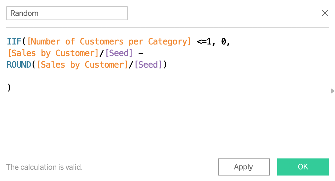
The result of this calculation is between -0.5 and 0.5, if [Seed] is small enough compared to the sales figures given by the customer.
Beware, if your data is only containing integers, then Seed must be set to a relatively high number in order to create a cloud-like effect. So there is a medium that depends on your data. In a new table, drag ATTR([Random]) into the columns and MIN([Sales by Customer]) into the rows. Add [Customer Name] to the tags and [Label Category by Customer] All you have to do is drag a Box Whisker Plot / Box Plot or box graphic onto your Dashboard (by selecting MIN([Sales by Customer]) as shown below).
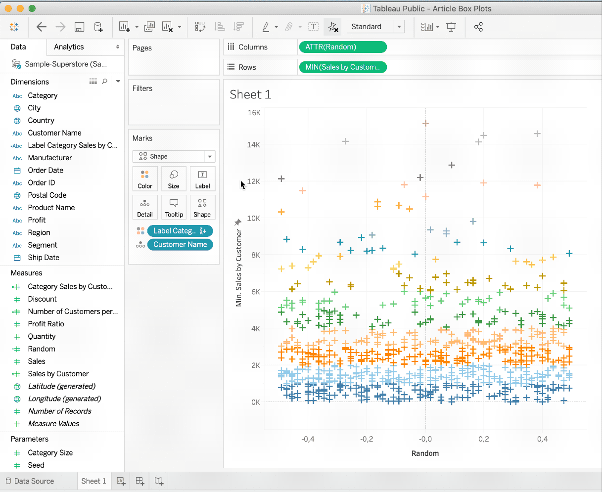
It should be known that the ATTR function is actually a MIN and a MAX function. It will only return a value if MIN and MAX are the same. In this way, you can verify the correct aggregation of the data. However, if you are confident in the aggregation of your data, using the MIN (or MAX) function saves a calculation and can, therefore, make your dashboard a little faster. We'll see later why I'm forced to use ATTR for columns..
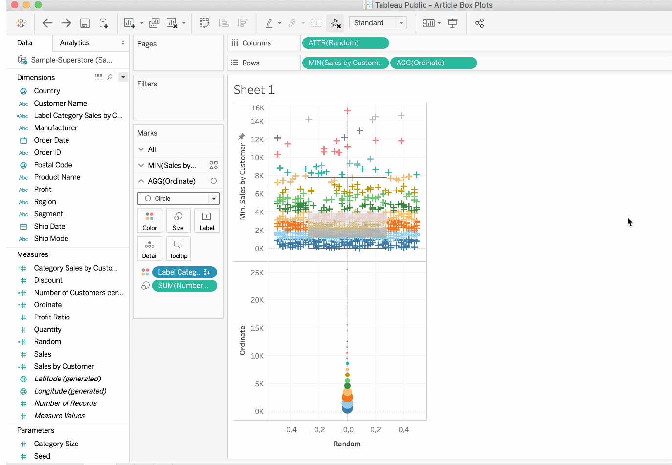
3. Using the dual-axis feature in Tableau
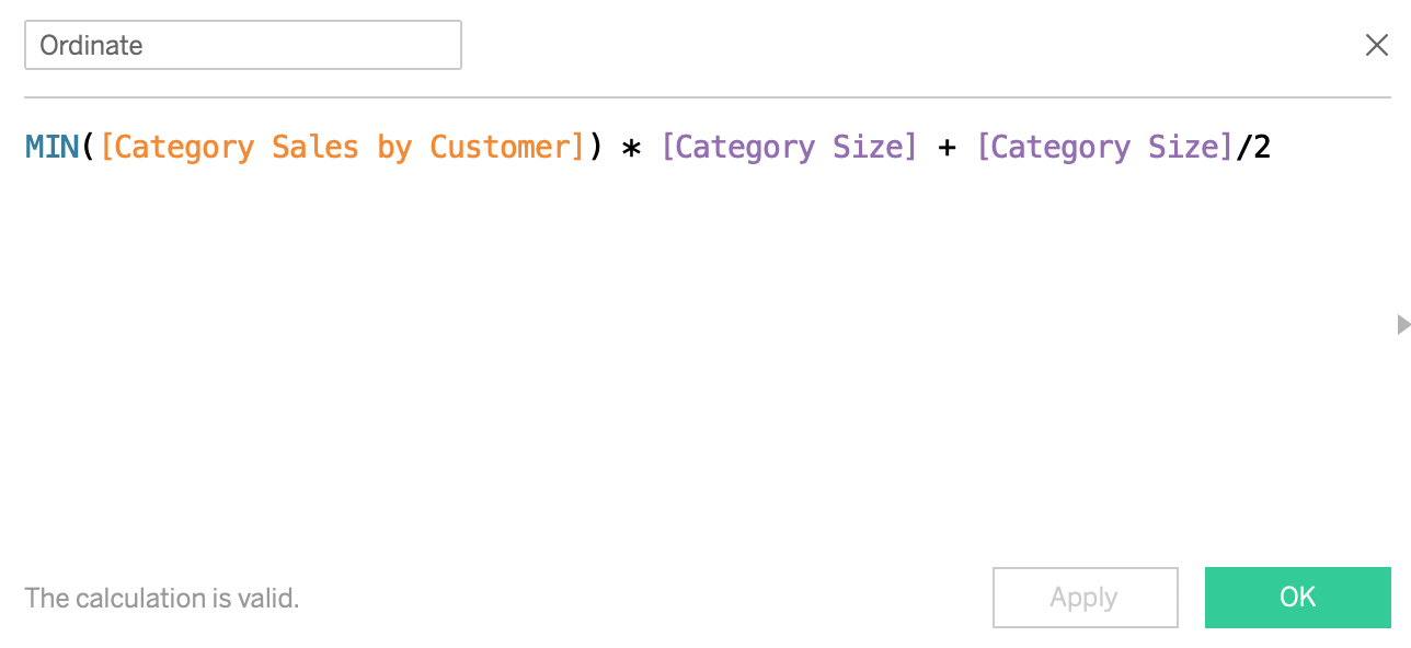
Now that we've created our two dashboards, we have to combine the two dashboards. I use the Dual Axis function in Tableau. I also simply calculate the ordinate of the aggregations to place the points in the median of the categories. If the category 2000 is x 2999, I usually set the point to 2500. Of course, you can also set it to 2000, if you prefer. I 'll call this calculation [Ordinate] out of a severe lack of inspiration this weekend:
MIN([Category Sales by Customer]) * [Category Size] + [Category Size] / 2
Then follow these steps:
- Place [Ordinate] on rows
- Delete [Customer Name] from AGG [Ordinate]
- Instead, drag [Number of Clients per Category] to the mark size of [Ordinate].
- Select the Dual Axis function for [Ordinate].
- Synchronize the axis on the right side
- Deactivate the option Show header on right axis
- Make aesthetic adjustments (transparency, size of the elements)
The last four points are also visualized here:
And that's it! You can download the visualization on Tableau Public .